When Sony launched the PlayStation, they aimed for a different audience than other consoles before it had. In August 1994, Sony Computer Entertainment employed a marketing manager called Geoff Glendenning. Glendenning recognised that gamers who’d grown up playing on the Mega Drive and SNES wanted to continue playing games, but would be more attracted towards machines that were targeted towards their age ranges, rather than still buying machines that were targeted towards children. This also fit in with Sony’s general desire to expand the gaming market, as these people would also have much more disposable income than children would.
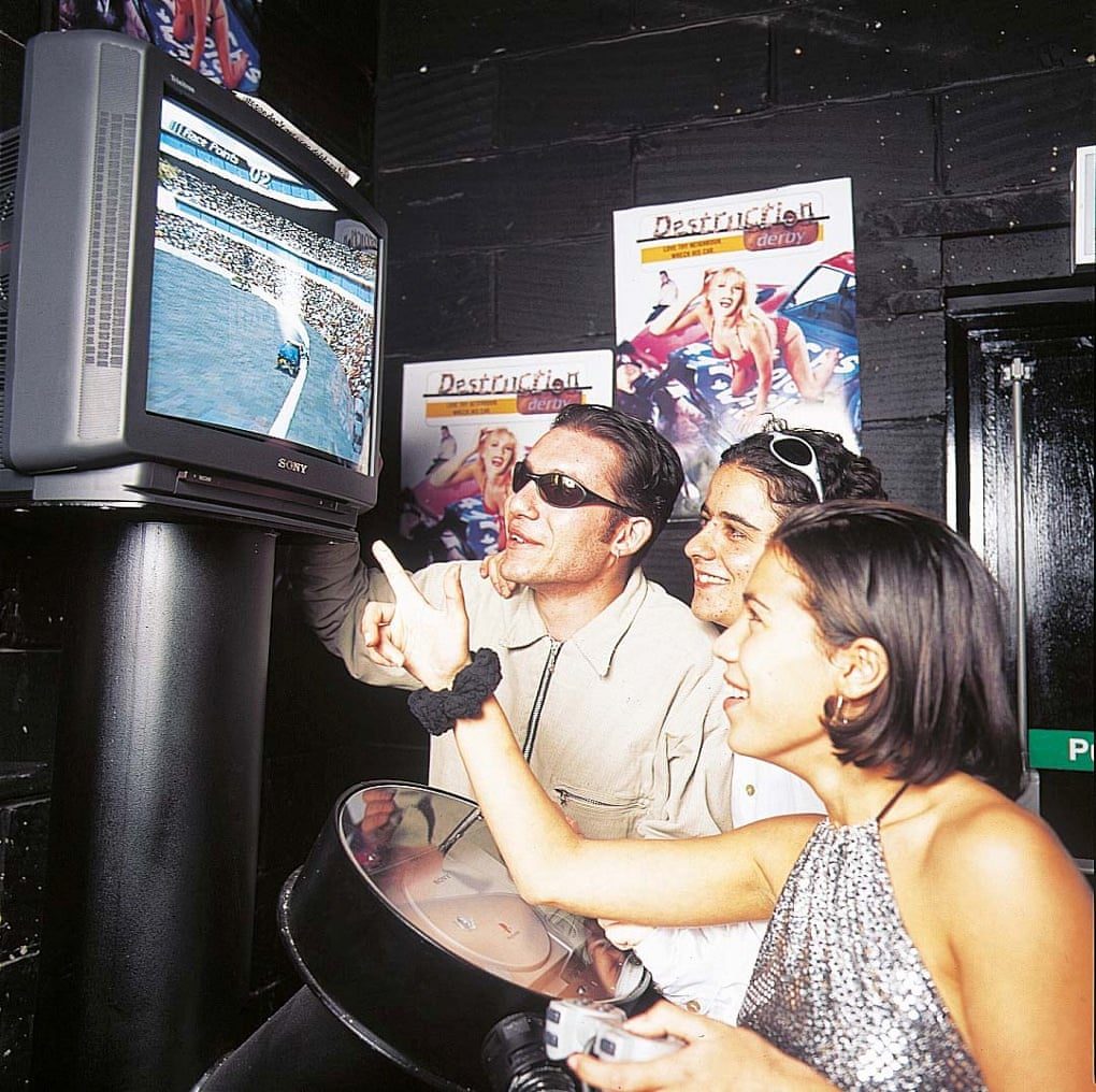
Sony recognised that in order for this strategy to work, they would have to link the console in with the youth culture in each region, and it had to be done in a way that was specific to each one. Glendenning was part of the rave culture in the late eighties, and recognised that the underground club scene was starting to become mass market in the UK. Glendenning and his team contacted nightclubs and festival promoters directly, setting up dedicated PlayStation areas in clubs and festivals where people could take a break and play games, eventually setting up over fifty-two clubs in the UK alone with dedicated PlayStation rooms. They also wanted to be edgy, with a famous flyer which said the PlayStation was ‘More Powerful Than God’ at the 1996 Glastonbury Festival, which went down well with it’s intended audience.
Other regional marketing departments caught on to their success, and set up their own connections based on what they believed would work well in their markets. For example, in the United States, they believed that extreme sports was the way to go, and sponsored many events and teams.
Sony managed to achieve the perfect partner for this marketing strategy in the UK, with their studio Psygnosis that they had purchased in 1993. Although Sony owned Psygnosis, they maintained a high level of independence, and would still release games for other systems from time to time. Psygnosis received a development kit to their office on the Liverpool docks in 1994 and began working on WipEout right away. Thanks to Sony’s developer friendly strategy, western developers were well supported from the outset, meaning they would be able to take good advantage of the system right away.
The game was a racer set in 2052, in which players competed in the F3600 anti-gravity racing league. It featured cutting edge physics, 3D polygonal graphics that looked great and were fast at the time, as well as a plethora of weapons and power-ups. It was a very fun game, and a brilliant launch title for the PlayStation.
Merging perfectly with the group that Sony was attempting to infiltrate, WipEout featured music by the Chemical Brothers, Leftfield and Orbital, which it was able to do by utilising it’s vast music division. Additionally, they brought in the Designers Republic, a studio which developed icons and artwork for the branding and marketing of the game.
So far, so good. The game was a hit, Sony had successfully managed to entice twenty somethings to purchase PlayStations, and at the same time, make it culturally acceptable for adults to be gamers. So, what was the problem? Well, not everyone was happy with this marketing strategy.
You see, at the time, the club culture wasn’t just associated with dancing and music. It was associated with heavy binge drinking, and of course, sex and drugs. Drugs in particular were becoming increasingly associated with the scene, which meant that people of a more conservative nature, did not like youth culture at all, despite the fact that youth culture has never been liked by conservative people, no matter what form it takes.
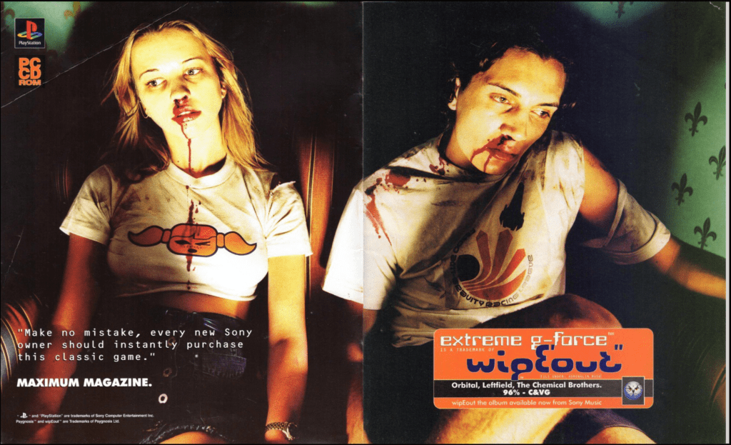
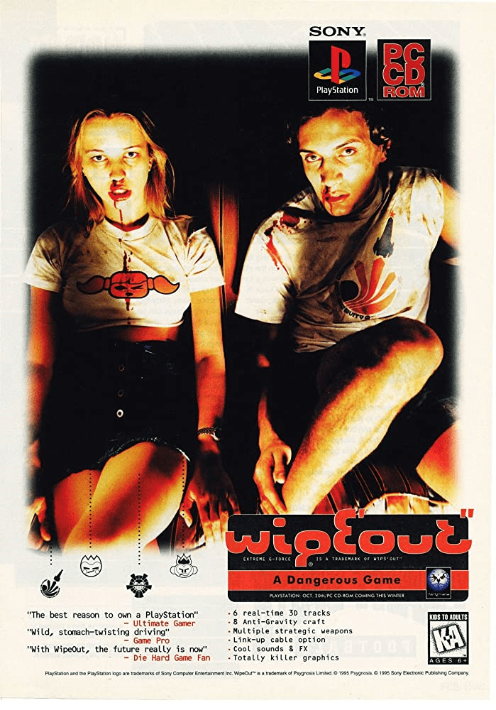
This meant that when Sony started explicitly associating itself with this culture, it was bound to cause some friction. When they began the marketing campaign for WipEout, Designers Republic along with Psygnosis came up with a poster intended to both promote the game, and the style that Sony was going for. This is that poster.
So, what can we say about this poster. It features two young people slumped over, with blood heavily pouring out of their noses and onto their shirts, which contain icons from the Designers Republic designs. They are looking glassy eyed into the distance, and it’s quite clear what has happened to them. People either made connections to drugs, or having their minds blown by the game. Either way, what’s the problem right? They made a game for young adults, marketed it in clubs, and used posters which would appeal to them. Well, this was the problem.
You see, despite the fact the marketing of the game was geared towards a specific audience, there was nothing actually in the game that was objectionable. It was just a futuristic racing game with a cool soundtrack, that was all. This however, did not go down very well in the press.
There was quite a bit of noise made over this poster in particular, mostly stemming from conservative and middle class england. The gutter press of course decided to fan the flames on this. The newspaper, and I use that term loosely, The Sun, chose its words very carefully. Firstly, the header of the article referred to WipEout as a ‘kids game’. They neatly ignored the fact that it is simply suitable for all ages.
It stated that ‘An Ad for a Sony computer game aimed at kids as young as three, has been blasted as glamorising drugs’. They really stretched the connections here, by stating that a game that actually had nothing objectionable in it at all, was somehow a problem because it didn’t have anything objectionable in it, is quite a strange thing to do. They took the lowest possible age rating and immediately made it seem as if this was a game targeted towards three year olds, clearly wanting to rile up people that did not know better, and had no idea about video games. Despite Sony capturing the youth market itself, the older market still considered games as being for children, and would look for any reason to be outraged.
They go on to say that the ‘E’ in WipEout is supposed to stand for Ecstasy, whilst Sony said it was just supposed to make it stand out. And of course, Conservative MP Terry Dicks, who in my Sega Sickener article said that SEGA should be punished for publishing Night Trap, in this situation, says that the poster is a complete outrage. So, what was the truth behind that poster? To find out the real story, I spoke to Ian Anderson, who was part of the group at the Designers Republic that worked on the campaign.
I asked him what the main idea was behind the poster. He said it was ‘Speed. However you want to interpret that’. He said that the design felt like a natural thing to do, intended to be edgy and push boundaries, a sense of wanting to be confrontational, looking to provoke a response from people predisposed to be offended. He felt that although they was aware of the controversy, to them it didn’t really matter – those people were just small minds, and didn’t impact on them at all. It achieved the goal of raising the profile of WipEout and positioning it as an edgy game, fuelled by an energy that would bring in a wider audience. He leaves off by saying that culture eventually celebrates rebels and outsiders, and links WipEout in the same vein as Robin Hood, Elvis and the Sex Pistols.
What do you think about this poster? Do you reckon society has changed, or it would still be as controversial today? Seeing posters like this makes me pine for an age when marketing for games wasn’t just the usual bunch of trailers and streamers playing it early, but proper in your face tactics. I wonder if any company will ever bring that back?
If you’re interested in other controversial moments in gaming history, check out the fallout from Night Trap.


